Connecting, the three dots are animated, with one white, then 2, then 3, then 1 etc.
Connected, one connection active
Any additional connection will increase the number.
My idea was something like this:
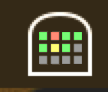
Where green means connected, red indicates trouble and yellow or pulsating green is connection in progress.
Disregard the tunnel around the grid, the coloured grid is what is most important, from it I can see my 12 favourite connections and their status, even with just a glance.
And by removing the tunnel outline you could fit even more coloured squares, or make them bigger.
One other thing on the topic of connection visibility, when you have tagged your connections you have to click the menubar and navigate to each tag to see which connections are active.
Some kind of indicator for each tag would be nice too - e.g 2/3 meaning 2 of 3 connections are active.
The menu bar icon is small, and most app icons are designed to be greyscale. Instead of menu bar icon, I prefer to add colorful label in dock icon, as in uTorrent.app:
For stuff that runs in the background, I prefer to turn off the Dock icon, so this won't work for me.
It is possible to do a nice gray scale connection indicator menubar icon, or you could go totally nuts like iStat menus (which I also use) with colours and graphs.
In my opinion a menubar icon should provide useful information to earn its place in my menubar.
I hide all "forced" menubar icon that doesn't provide useful information with Bartender.


 Thanks a lot for the inspirations. We will improve the menubar icon step by step.